John Green books are known to combine beautiful experiences in love, friendship, and adventure with tough topics like mental illness, suicide, loss and grief. Although generally listed as “young adult” books, the topics covered within these novels can be interesting and enjoyable to both adolescents and adults alike.
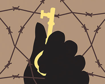
Using a combination of key images collected from each storyline, these book covers are able to reach a wide audience by elevating the target age group from an adolescent-aged audience to a more mature audience. The imagery chosen for the books consist of symbols or key objects from within each individual book, creating a loose foreshadowing effect. The colors were designated based on the tone and events within each story.
Scope: Collage, Layout, Copywriting, Color, Typography
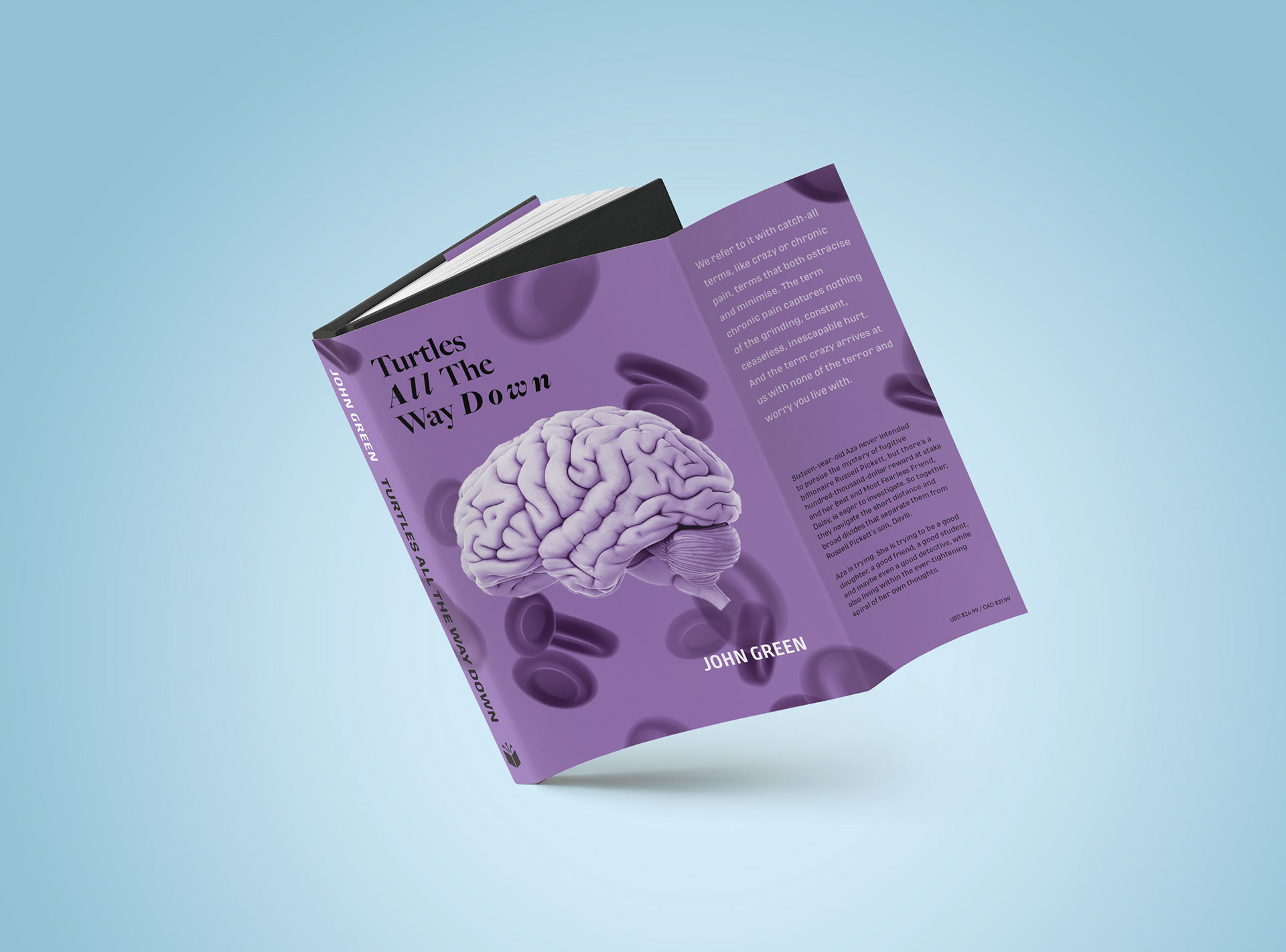
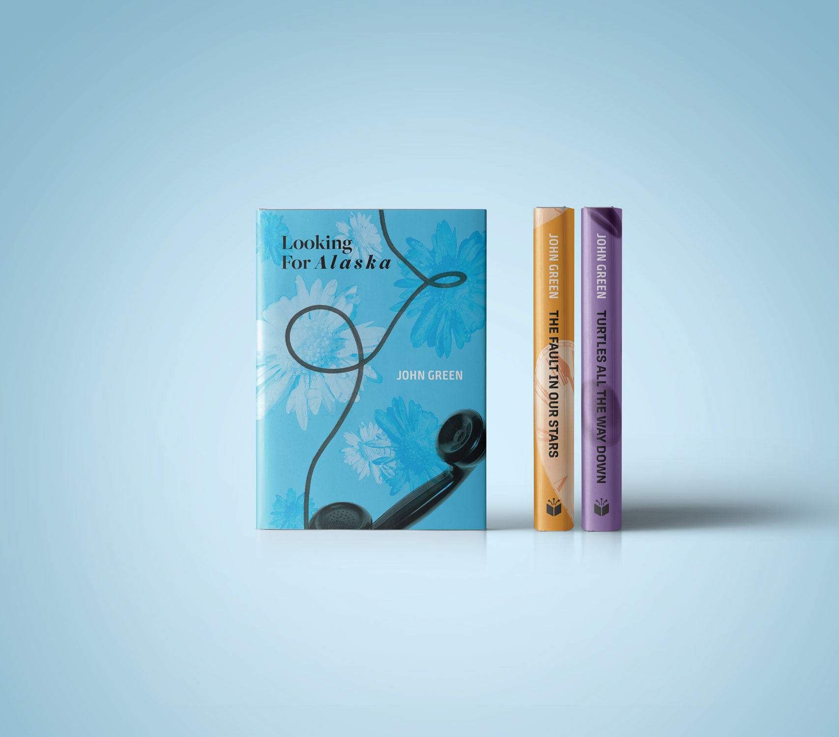
The color breakdown:
Blue - represents sadness and creates a moody tone; Looking For Alaska is a sad book about a troubled girl and touches on topics like death and suicide.
Orange - represents joy; Although the events that unfold at the end are sad, The Fault In Our Stars truly emphasizes the importance of enjoying the life you have, no matter how long or how short it may be, and finding joy in grief.
Purple - represents calmness, reflection, and self awareness. It is a balance of red and blue: red being alarming, chaotic self destruction, while blue can be seen as calming. Turtles All The Way Down is centered on the topic of crippling mental illness and learning to cope in order to create a calm mind.
